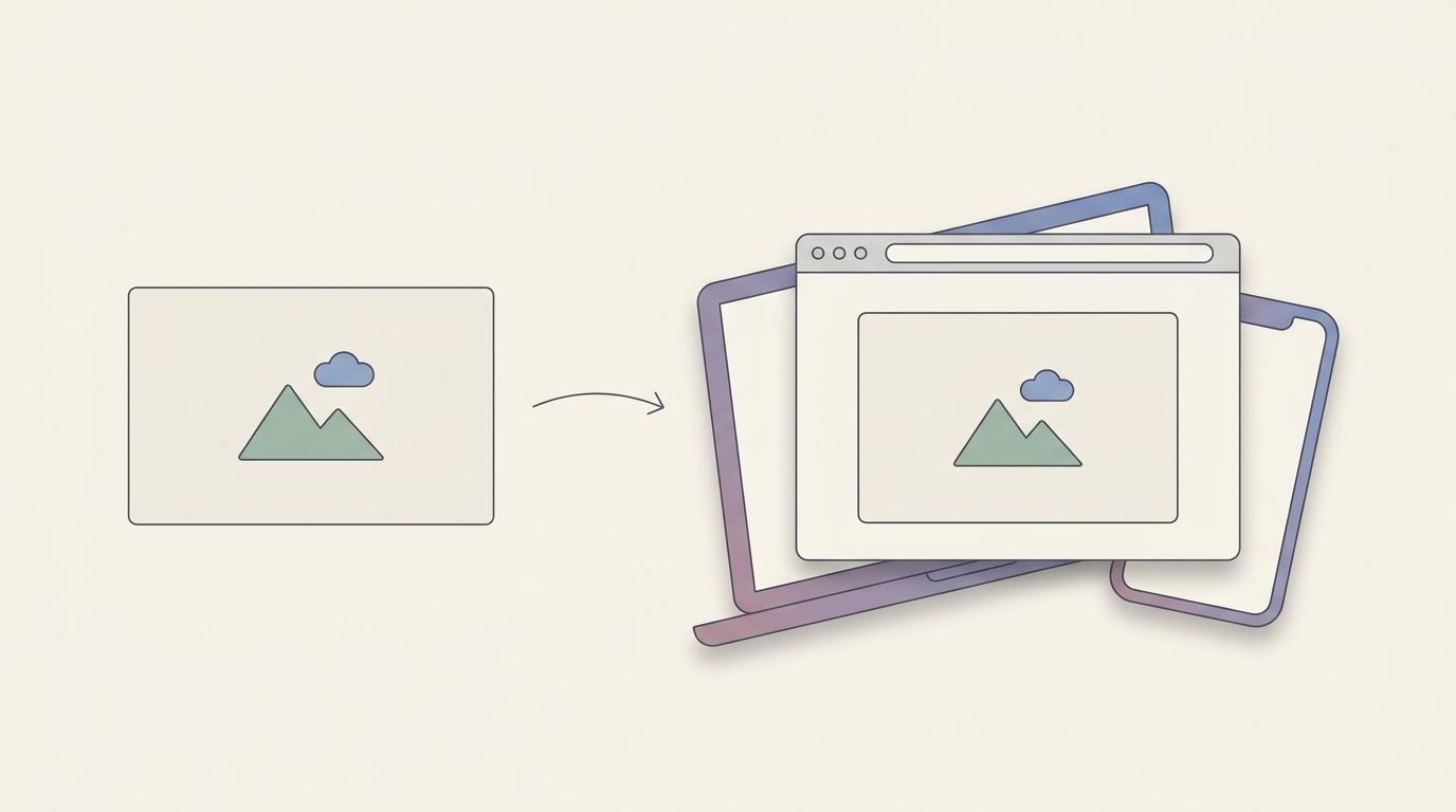
A screenshot dropped straight into a landing page, an app store listing, or a launch post looks like exactly what it is: a flat crop of a screen, edges cut off mid-pixel. A device mockup fixes that by placing the same screenshot inside a browser window, a phone bezel, or a laptop shell — context that tells the viewer what they're looking at before they've read a word of copy.
It's a small visual trick, but it shows up constantly: App Store and Play Store screenshots, Product Hunt launch images, portfolio case studies, investor decks, Twitter/X product announcements. Anywhere a screenshot is the hero image instead of a supporting detail, a mockup usually makes it look intentional rather than dashed off.
What a device mockup actually does
A mockup wraps your screenshot in a frame that matches the device or surface it would realistically appear on:
- Browser frame — adds a window chrome (tabs, URL bar, traffic-light buttons) around a web app or website screenshot, so it reads as "a website" rather than an unbounded rectangle of UI.
- Phone frame — places a mobile screenshot inside an iPhone or Android bezel, useful for app store assets and social posts about mobile features.
- Laptop or desktop frame — sets a desktop screenshot into a MacBook or monitor shell, common for SaaS landing pages and portfolio shots.
The effect is mostly about framing, not retouching. The screenshot's content doesn't change — it just gets a believable container instead of floating on a plain background.
When you actually need one
Not every screenshot needs a frame. A frame earns its place when the image needs to communicate what kind of product this is at a glance:
- App store listings. Apple and Google both display screenshots in a grid where context is stripped away — a phone frame restores it instantly.
- Landing page hero images. A bare screenshot next to marketing copy looks unfinished; a laptop or browser frame makes it look like a real, shipped product.
- Launch posts. Product Hunt, Twitter/X, and LinkedIn posts compete with a feed full of polished visuals. An unframed screenshot stands out for the wrong reason.
- Portfolios and case studies. Designers and agencies use mockups to show work in a believable context rather than as raw exports from Figma.
For internal use — Slack messages, bug reports, quick documentation — a frame is overkill. It's a presentation tool for screenshots that are going somewhere external, not a default for every capture.
Two ways to add one
There are two general paths, and which one makes sense depends on how often you need this.
Dedicated mockup generators
Tools like Mockuuups Studio, Smartmockups, and Screenhance exist specifically to wrap images in device frames, and they're genuinely good at it — large frame libraries, photorealistic rendering, and options that go beyond screens (mockups on billboards, apparel, packaging). The tradeoff is the workflow: you export your screenshot from wherever you captured it, upload it to the web tool, pick a frame, download the result, and then often still need to bring it back into another app to add a background, annotation, or crop. Pricing is also subscription-based across most of these — Mockuuups Studio runs a paid tier in the $19/month range, Smartmockups around $14/month, and lighter alternatives like Screenhance offer cheaper monthly or one-off passes. That's a reasonable cost if device mockups are a steady part of your design output, but it's a recurring line item for what's often an occasional need.
A mockup feature built into your screenshot tool
Several screenshot beautifiers — Savvyshot among them — build device mockups directly into the same editor used for capture, backgrounds, and annotation. The practical difference is that there's no round trip between apps: you capture or import a screenshot, drop it into a browser or device frame, adjust the background and padding around it, and export — all in one pass. It's less flexible than a dedicated mockup library (fewer frame styles, no apparel or billboard mockups), but for the common case of "make this screenshot look like a real product for a launch post or landing page," it removes a step rather than adding one.
This is also where the pricing model differs in a way worth noting if you're choosing a tool: Savvyshot uses a one-time license rather than a subscription, so a feature like device mockups is something you pay for once rather than something that adds to a recurring mockup-tool bill. The free version is usable but adds a watermark and limits presets; a paid license removes the watermark and unlocks the fuller feature set.
Getting a good result, regardless of tool
A few habits separate a mockup that looks deliberate from one that looks like a default template was slapped on:
Match the frame to the platform. A browser frame around a screenshot of a mobile app reads as a mismatch. Use the frame that matches what the screenshot is actually a screenshot of.
Keep a consistent device family across a set. If you're producing five App Store screenshots, use the same phone model and orientation for all five. Mixing frame styles within one carousel looks unplanned.
Don't over-frame. A frame adds visual weight. If the screenshot is already busy — dense UI, a lot of text — a heavy bezel competes with the content instead of supporting it. Sometimes a plain background with padding communicates more cleanly than a full device shell.
Mind the file size for store listings. App Store and Play Store screenshots have specific dimension requirements per device class. Export at the exact size the listing wants rather than a generic mockup export — most platforms will reject or awkwardly crop assets that don't match.
Leave room for store text overlays. If you plan to add a headline above or below the device frame (common in App Store screenshots), frame the screenshot smaller within the canvas so there's space, rather than cropping in afterward.
Watch the bezel color against your background. A black phone frame on a dark gradient background can lose its edges entirely. If the frame and background are both dark or both light, add enough contrast — a lighter background, a subtle shadow under the device — that the frame stays legible as a separate object rather than blending into the canvas.
Test at the size it'll actually be viewed. A mockup that looks sharp full-screen on your monitor can turn into a blurry thumbnail in an App Store grid or a Twitter timeline preview. Export a sample and check it at the actual display size before finalizing a batch.
Do you actually need a dedicated mockup tool?
It depends on volume and variety. If device mockups are a core part of your output — an agency producing client mockups across phones, apparel, and packaging every week — a dedicated tool's frame library and rendering quality are worth the subscription. If you mainly need to dress up your own product or app screenshots a few times a month for a launch post, a landing page update, or a store listing refresh, a screenshot tool that already has a mockup feature built in avoids paying for and learning a second piece of software for an occasional task.
The honest middle ground: try the built-in option first. If you find yourself wanting frame styles or surfaces it doesn't support, that's the signal to add a dedicated generator to the toolkit — not the default starting point.