A single annotated screenshot is easy to get right: point at the thing, say what it does, done. A step-by-step tutorial is harder, because now you're managing a sequence — five, ten, sometimes thirty screenshots that all need to look consistent, stay in order, and read correctly even if someone skips ahead or opens the guide six months from now.
This shows up constantly outside of published documentation, too: a support agent building a macro to send customers, a founder writing a setup guide for a new feature, an ops lead documenting a process so it doesn't live only in one person's head. All of it is the same underlying problem — turning a sequence of actions into a sequence of images someone else can follow without you standing behind them.
Script the Steps Before You Capture Anything
The most common failure mode isn't bad screenshots — it's screenshots taken in the wrong order, at the wrong zoom level, or missing a step that seemed obvious while you were doing it.
Before opening a capture tool, write the steps as a plain numbered list, in your own words, without touching the app yet: "Open Settings," "Click Integrations," "Paste the API key," "Click Save." Walk through the process once and check the list against what actually happens. It's much cheaper to catch a missing or reordered step at this stage than after you've already captured and annotated fifteen images.
This also tells you your shot count up front. If a step doesn't change what's visible on screen, it doesn't need its own screenshot — fold it into the text of the previous step instead.
One Action, One Screenshot
The same discipline that keeps a single screenshot from getting cluttered applies at the sequence level: each screenshot should represent one action, not "everything that happened in this part of the flow."
If a step involves clicking a menu, then a submenu, then a button, that's plausibly three screenshots or one screenshot with a numbered path — but it's not one screenshot showing the end state with no indication of how the reader got there. When a reader has to guess which of four visible menu items led to the next screen, they'll eventually guess wrong, and now they're troubleshooting your tutorial instead of following it.
A useful test: if you can't summarize a screenshot's purpose in one short sentence, it's covering more than one step and should be split.
Keep the Frame Consistent Across the Whole Sequence
Nothing signals "assembled in a hurry" faster than a tutorial where screenshot 3 is a tight crop of a dialog box, screenshot 4 is the full browser window, and screenshot 5 is zoomed to 150%. Readers build a mental map of the interface as they scroll, and inconsistent framing forces them to re-orient on every image.
Decide on a capture style before you start — full window, or a consistent region crop — and stick to it for the whole sequence. If you're adding padding, a background, or a border, save that setup as a reusable preset rather than re-configuring it screenshot by screenshot. In Savvyshot this is what canvas profiles are for: dial in padding, aspect ratio, and background once, save it as a profile, and every screenshot in the sequence renders identically without you re-adjusting settings on each one.
Number the Steps So Order Isn't Optional
Captions imply order ("Step 1," "Step 2"), but the images themselves often don't — which matters the moment someone pastes screenshots into a Slack thread, a PDF export reflows, or a reader opens the guide at the fourth image because that's the one they needed. A visible number on the image itself removes the ambiguity entirely.
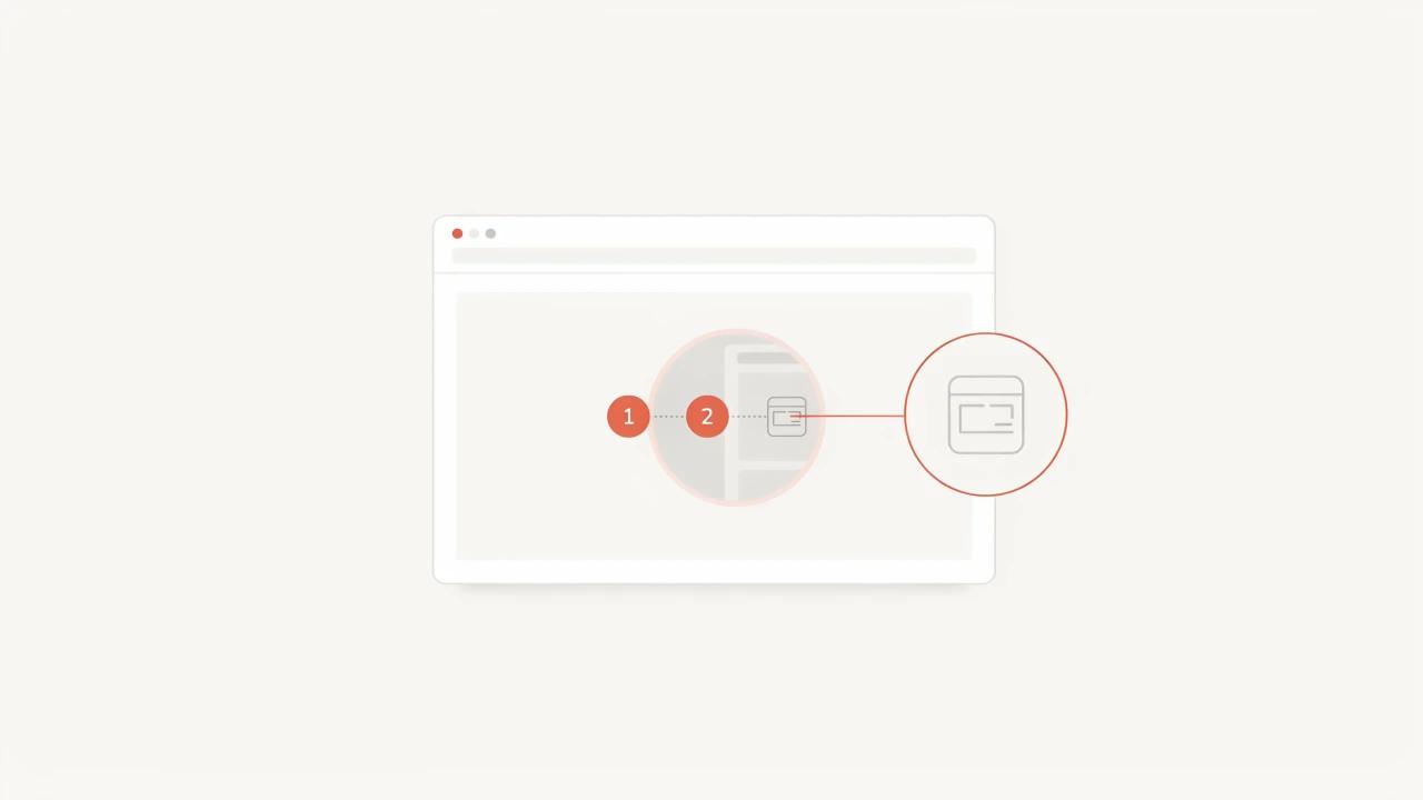
Savvyshot's annotation toolbar includes a dedicated Step Counter tool (shortcut N) for exactly this: it drops a numbered circular marker that auto-increments each time you place one, in either a full-circle or pointed-corner style. Rather than manually typing "1," "2," "3" as text labels and keeping track of which number you're on, you place markers in sequence and the numbering takes care of itself — useful when you're annotating a long walkthrough and don't want to lose count halfway through.

Focus Attention Without Adding More Arrows
In a single-screenshot annotation, an arrow or highlight box is usually enough. In a long tutorial, repeating the same arrow style forty times starts to blend together, and some steps need something more deliberate.
A Spotlight annotation — available in Savvyshot alongside the standard shape and arrow tools — dims the entire canvas except for the area you draw around, so the eye goes straight to what matters without needing a caption to explain where to look. It's a good fit for the step in a tutorial where a reader is most likely to get lost: a settings toggle buried in a dense panel, or a button that looks similar to three others nearby. Reserve it for the one or two genuinely confusing steps in a sequence rather than using it throughout — if every screenshot is spotlighted, none of them stand out.

Handle Small Details With a Magnifier, Not a Zoomed Screenshot
Some UI elements — a status dot, a small icon, a checkbox — are too small to annotate clearly at normal screenshot resolution, and zooming the whole capture in loses the surrounding context a reader needs.
Savvyshot's Magnifier tool (shortcut M) addresses this directly: it places a dashed box over the small detail and connects it to a magnified 2× "loupe" elsewhere on the canvas, so the screenshot shows the full context and the zoomed-in detail at the same time. For tutorials where a step depends on noticing something small — a green checkmark that confirms a save, a tiny dropdown arrow — this is more reliable than asking the reader to spot it themselves in a normal-resolution capture.

Write Captions That Add Information, Not Just Describe the Image
A caption that says "Click Save" under a screenshot with an arrow pointing at a Save button is redundant — the image already made the point. A better caption adds the thing the image can't show: why the step matters, what to expect next, or a warning about a common mistake ("Save doesn't apply until you also click Publish"). If your caption and your annotation are saying the exact same thing, cut one of them.
Keep captions short — two to three sentences at most. If a step needs a paragraph of explanation, the interface is probably confusing enough that the fix belongs in the product, not the documentation.
Redact Before You Batch-Capture
Tutorials often get built from a real account, a real inbox, a real customer record — because setting up clean dummy data for thirty screenshots is its own project. That means sensitive details (emails, names, account numbers) tend to slip into documentation screenshots more than into one-off shares.
Handle this once, at the start of the batch, rather than screenshot by screenshot: Savvyshot's auto-redaction scans a capture for common sensitive patterns and blurs them automatically, so you're not manually checking each of thirty images for a stray email address before publishing.
When a Manual Screenshot Tool Isn't the Right Fit
Everything above assumes you're capturing and annotating screenshots by hand, which gives you full control over framing, numbering, and what gets emphasized — but it does take time per step. If you're documenting a process you'll need to update constantly, or producing dozens of similar internal SOPs where visual polish matters less than speed, an auto-capture workflow recorder is worth considering instead.
Tools like Scribe and Tango watch you click through a process and auto-generate a step-by-step guide with a screenshot and description for each action, with no manual capture or annotation required. The tradeoff is control and cost: both are subscription products aimed at teams, with paid tiers landing around $20–25 per user per month (Scribe's Pro Personal plan and Tango's Pro plan are both in that range), and the auto-generated framing and callouts are less customizable than annotating by hand. For a support macro or onboarding guide that needs to look a specific way — matching your brand's colors, keeping a consistent canvas style, using a spotlight instead of a generic box — manual capture and annotation still wins. For internal process documentation that changes often and doesn't need to look polished, letting a recorder do the capturing can be the better trade.
A Working Checklist
Before publishing a step-by-step guide, run through this:
- Every step scripted and walked through once before capturing
- One action per screenshot — nothing split across two steps, nothing cramming two steps into one
- Consistent framing and background across the whole set (a saved canvas profile helps)
- Numbered markers on any sequence where order matters
- Spotlight or magnifier used only where a step is genuinely hard to spot — not on every image
- Captions that add context the image doesn't already show
- Sensitive data redacted before the sequence goes anywhere outside your team
None of this is complicated on its own. What makes step-by-step tutorials hard is doing all of it consistently across a long sequence — which is exactly where a plan made before the first screenshot, and a consistent toolset for numbering and focus, save the most time.