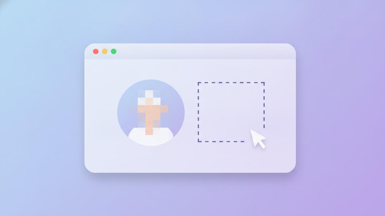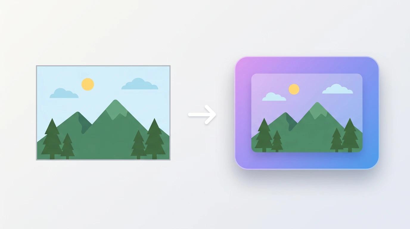
A raw screenshot — no padding, no border, just the screen content cropped to a rectangle — reads as unfinished. It works fine for a quick internal Slack message. It doesn't work for a landing page, a product update, a portfolio piece, or anything going somewhere people are judging quality alongside content.
A background changes that almost instantly. Here's why it matters, what your options are, and how to pick the right style for where the screenshot is actually going.
Why a Plain Screenshot Looks Unfinished
A screenshot is a rectangle with hard edges and whatever color happened to be at the boundary of your capture. There's no visual separation between the content and whatever it's sitting on — a Slack message, a slide, a web page — so it tends to look like it was dropped in rather than designed in.
Three small additions fix most of this:
- Padding — breathing room between the screenshot and its edges
- A background — something behind the screenshot instead of empty white space
- A subtle shadow — lifts the screenshot off the page slightly, like a card
None of these change the actual content. They just frame it — and framing is most of what separates a "screenshot" from a "visual."
The Five Background Types (and When to Use Each)
Not every background style fits every context. Here's a practical breakdown:
1. Solid color
The simplest option, and often the most professional. A solid background — especially in a brand color or a neutral gray — keeps focus entirely on the screenshot content with zero visual noise.
Best for: Support documentation, internal wikis, anywhere clarity matters more than visual flair.
2. Gradient
A linear or radial gradient with two or three color stops adds depth without being distracting. The most common approach is a diagonal gradient between two colors in the same family — deep blue to purple, or teal to green — which reads as modern without trying too hard.
Best for: Product marketing, social posts, app store screenshots, landing pages — anywhere you want the screenshot to feel like a "visual" rather than a capture.
3. Image
A custom image or one from a bundled asset library gives more texture than a flat color or gradient, useful when you want a specific mood (e.g. a soft blurred photo background behind a product screenshot).
Best for: Marketing assets where you want a specific aesthetic tied to your brand.
4. Live photo search
Rather than sourcing your own images, you can search a stock photo library by keyword directly inside your screenshot tool and apply a result as the background. Useful when you need a background fast and don't have brand assets on hand.
Best for: Quick one-off social posts or presentations where speed matters more than exact brand consistency.
5. Video background
An animated video clip behind your screenshot, optionally with a blur effect applied, exported as a GIF or short video file. This is a step beyond a static background — it turns a screenshot into a short, shareable clip.
Best for: Social media posts and product announcements where motion helps the post stand out in a feed.
Canvas Settings That Matter More Than People Think
The background gets the attention, but a few canvas-level settings do more for the final look than people expect:
- Padding — even a small amount (8–24px) prevents the screenshot from feeling cramped against its background. More padding generally reads as more "premium."
- Border radius — rounding the corners of the screenshot itself (not just the canvas) softens the whole image. Most modern UI screenshots use somewhere between 8–16px.
- Shadow — a soft drop shadow behind the screenshot creates separation from the background, making it look like a floating card rather than a flat image.
- Aspect ratio — match the ratio to where it's going. Square (1:1) for Instagram feed posts, vertical ratios for Stories or app store listings, 16:9 for slides and presentations.
A subtle gradient or blurred image background combined with generous padding is one of the most reliable ways to get a "marketing-ready" look without much design effort.
When to Skip the Background Entirely
Not every screenshot needs one. If you're sending a quick screenshot in a support ticket or a Slack thread to flag something specific, a background adds nothing — the recipient just wants to see the issue, fast. In those cases, skip the background section and set padding to zero, or just send the screenshot as-is.
Save backgrounds for screenshots that are going somewhere people are evaluating quality, not just information — marketing pages, social posts, portfolios, product pages, app store listings.
Matching Background Style to Platform
A background that works on one platform can feel off on another:
- Twitter/X — gradients in cooler tones (blue/purple) tend to perform well and feel native to the platform's visual style
- LinkedIn — subtle grays and muted blues read as more professional than bold, saturated colors
- Instagram — bolder, more saturated backgrounds and video clips stand out better in a fast-scrolling feed
- Documentation/support — solid neutral colors or no background at all; clarity beats style here
If you're publishing across multiple platforms, it's worth saving 2–3 background presets matched to each one rather than reusing a single style everywhere.
Building a Consistent Look
Once you land on a background style that works, consistency matters more than novelty. Reusing the same padding, border radius, and background style across every screenshot you publish makes your content instantly recognizable — readers start to associate that visual style with your brand before they even read the text.
Most screenshot tools let you save your canvas and background settings as a reusable preset or profile, so you're not rebuilding the same look from scratch every time. It's worth taking five minutes to set this up once rather than eyeballing padding and color on every new screenshot.
The Bottom Line
A background isn't decoration for its own sake — it's the difference between a screenshot that looks like a quick capture and one that looks intentional. A solid color works for documentation. A gradient or blurred image works for marketing. Video backgrounds work when you want motion in a feed. Pick the style based on where the screenshot is going, not what looks best in isolation, and keep it consistent once you've found something that works.