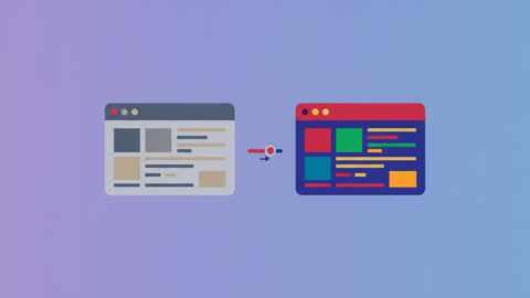
You capture a screenshot, drop it into a doc or a landing page, and it looks noticeably flatter than what was on your screen a second ago — colors a shade duller, contrast softer, whites that read as gray instead of white. Nothing about the UI actually changed. This is common enough that it's worth understanding why it happens, because the fix is usually a few seconds of work, not a trip into Photoshop.
What's Actually Causing It
A handful of different things produce the same "washed out" look, and they're worth telling apart because they call for different fixes.
Display color profile mismatches
Every monitor renders color slightly differently based on its color profile, brightness setting, and whether it's in an sRGB, P3, or a custom gamut mode. A screenshot captures raw pixel values, not "what your eye perceived while looking at a bright, well-calibrated screen." Move that same pixel data to a different display, a projector, or a printed page, and the perceptual gap between "looked fine on my monitor" and "looks flat everywhere else" becomes obvious.
Ambient light and screen brightness
If you're used to working with your display brightness cranked up, especially in a bright room, your eyes adapt to that brightness and the UI feels vivid. The screenshot doesn't carry that context — it's just pixel values — so viewing it later at a lower brightness, or on someone else's dimmer screen, can make identical colors read as duller than you remember.
Dark mode and light mode contrast differences
Dark-mode interfaces often use lower-contrast grays for secondary text and borders, by design, so the eye doesn't get fatigued by pure white-on-black. That's a reasonable choice for actual use, but it means a raw dark-mode screenshot can look muddy or low-contrast once it's isolated from the rest of the OS chrome and viewed as a standalone image.
Compression artifacts
Saving as JPG or WebP at a low quality setting introduces its own flattening — compression algorithms sacrifice fine color gradation first, since that's where file size savings are biggest and the loss is least noticeable in normal use. Push the quality slider too low and you'll see banding in gradients and a general loss of punch, on top of whatever display-related flatness was already there.
The capture pipeline itself
Some capture methods — particularly ones that go through an intermediate clipboard step or a lossy compression pass before you ever get to edit the image — introduce a small amount of degradation before you've made a single deliberate choice. It's rarely dramatic on its own, but it stacks with the other factors above.
Matching the Symptom to the Cause
Since several different problems produce a similar-looking result, it helps to know which symptom points to which fix before you start adjusting sliders at random.
| What you're seeing | Likely cause | Fix |
|---|---|---|
| Colors look dull everywhere, not just in one app | Display brightness or color profile | Brightness/contrast correction (manual or automatic) |
| Only dark-mode screenshots look muddy | Low-contrast dark-mode UI design | Contrast boost, or capture the light-mode equivalent if one exists |
| Gradients show visible banding or blocky steps | Over-compressed JPG/WebP export | Re-export at a higher quality setting, or switch to PNG |
| Looks fine on your monitor, flat on someone else's | Brightness/gamma mismatch between displays | Preview on a second screen before publishing |
| Whites look slightly gray, blacks look slightly washed | Narrow dynamic range from the capture itself | Levels/curves adjustment to reset the black and white points |
The Manual Fix
If you're editing in a general-purpose tool like Photoshop, Affinity Photo, or even Preview's markup tools, the fix is a Levels or Curves adjustment: pull the black point in slightly, push the white point up, and add a small contrast boost. For most screenshots this is a fast, forgiving edit — you're not trying to recover detail from a badly exposed photo, just restoring some of the punch that got lost in translation from screen to file.
A few things to watch for when doing this by hand:
- Don't overcorrect. UI screenshots have a lot of flat color fields (backgrounds, cards, buttons), and an aggressive contrast boost can start clipping those into harsh, unnatural blocks of color.
- Check text legibility after adjusting. Boosting contrast can occasionally blow out anti-aliased text edges, making small type look slightly jagged.
- Do it before you add a background or frame, not after. Adjusting brightness/contrast on a composited image (screenshot plus gradient background plus device frame) risks throwing off the frame or background colors along with the content you actually meant to fix.
The One-Click Fix
Manually tuning Levels for every screenshot gets old fast if you're producing more than a handful a week, which is why most screenshot editors that go beyond basic capture include some version of an automatic balance option. Savvyshot has this as Image balancing, a toggle in the Canvas section of the editor that automatically adjusts the brightness and contrast of the captured content — the same fix as the manual Levels approach above, applied without having to eyeball it. Because it's a canvas setting rather than a separate editing pass, it can also be saved as part of a canvas profile, so every screenshot you take with that profile gets the same correction automatically instead of needing the adjustment redone by hand each time.
It's a small feature, but it solves a real, recurring annoyance: the gap between "looks fine on my screen" and "looks flat once it's a static image somewhere else."
Reducing the Problem at the Source
Beyond fixing individual screenshots after the fact, a few habits cut down on how often you hit this in the first place:
- Export at higher quality settings. If you're saving as JPG or WebP, keep the quality slider closer to 90 than 60 for anything that isn't purely internal or disposable. The file size difference is usually small; the visual difference isn't.
- Prefer PNG for UI screenshots with flat color and text, where compression artifacts are most visible, and save JPG/WebP for photo-heavy content where lossy compression matters less.
- Calibrate or at least sanity-check your display brightness if you're regularly producing screenshots for other people to view — a monitor set unusually bright or dim skews your sense of how "normal" a screenshot will look elsewhere.
- Preview on a second device before publishing anything public-facing. A quick check on a phone or a colleague's laptop catches "looks flat everywhere but my desk" issues before they ship in a blog post or app store listing.
Where This Matters Most
The correction is worth the extra few seconds in some contexts far more than others.
App Store and Play Store listings. Screenshots there sit directly against a store's own background and other apps' listings — a slightly flat screenshot next to a competitor's punchy one loses the comparison before anyone reads a word of the description. Since these are also usually composited into a device frame, correcting the source screenshot's brightness and contrast before adding the frame keeps the whole image consistent, rather than fixing it after the frame is already in place.
Documentation and tutorials with a lot of screenshots. A single flat screenshot is barely noticeable. Twenty of them in a row, inconsistent with each other because some were captured on a laptop display and others on an external monitor, reads as sloppy even if no individual image is wrong. This is where a saved correction — a canvas profile, a Photoshop action, whatever your tool supports — pays off, because it applies the same fix uniformly instead of leaving it to per-image judgment calls.
Anything with a background or gradient behind it. Flat, low-contrast screenshot content next to a vivid gradient background makes the flatness far more obvious by comparison than the same screenshot on its own would. If you're using background styling at all, it's worth checking brightness/contrast on the screenshot itself first — a mismatch here is one of the more common reasons a "beautified" screenshot still looks a little off.
When Flat Actually Looks Fine
Not every screenshot needs correcting. Internal bug reports, quick Slack shares, and anything meant to be looked at for five seconds and forgotten don't need the same polish as a marketing screenshot or a portfolio piece. Save the brightness/contrast pass — manual or automatic — for screenshots that are actually going somewhere permanent: documentation, landing pages, App Store listings, social posts. For everything else, a slightly flat screenshot that gets the point across quickly is a better use of time than a perfectly balanced one that took three extra minutes.